We Are Wahoo: Rebrand Launched at Chamber Event

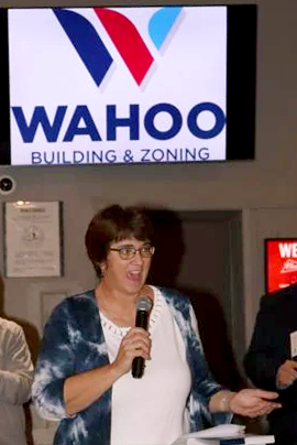
Theresa Klein announces the rebrand
(Photo by Suzi Nelson)
Taken from Wahoo Newspaper; Nov 16, 2022
WAHOO – A unique community with a unique name now has a unique brand.
The Wahoo Chamber of Commerce unveiled the results of a six-month project to rebrand the community.
The motto “We are Wahoo” was created as a result, with a tri-color logo that symbolizes the unity and spirit of the community. The new brand was unveiled at the Wahoo Chamber’s fundraising event Nov. 9 at Starlite Event Center.
Theresa Klein, executive director of the Wahoo Area Economic Development Office, said they assembled a Rebrand Team made up of stakeholders from government, business, school and city organizations. Team members are Ryan Ideus, Josh Krueger, Kevin Stuhr, David Privett, Kathryn Nygren, Katie Ostgren, Melissa Harrell, Ryan Hurst and Klein.
There were three reasons why the project came together, according to Klein. First, Wahoo is on the verge of growth and needs a brand that shows confidence in the future and a desire to invest in the community.
Second, leaders from the City of Wahoo, the Wahoo Utilities Department, Chamber of Commerce and Greater Wahoo Economic Development Foundation must continue to work in unison to guide Wahoo.
“We are speaking in one voice more now than ever,” Klein said.
The final reason is because the community of Wahoo is vibrant, successful and unique.
“We are surrounded by excellence in all facets of life,” Klein said.
The Rebrand Team enlisted the help of Filament Essential Services of Lincoln to guide the process. The company had done similar projects in Crete and Beatrice.
Matthew Landis, director of branding and video for Filament, said he learned a lot about Wahoo as he worked on this project. But a few things really stood out, he said.
“You all are competitive!” he said, which garnered a round of enthusiastic cheers from the crowd.
Wahoo’s competitive spirit is not cocky, however. It is a quiet confidence that shows up when needed.
“It was that, if push comes to shove, we’re going to win,” he said.
Wahoo seeks excellence in every area, Landis continued.
“You roll up your sleeves and you work for excellence in your schools, amenities, athletics, facilities, businesses, whatever,” he said. “You do not settle.”
The Rebrand Team was asked to choose a hypothetical spokesperson for Wahoo. It could have been anyone, alive or dead, famous or not.
“What blew me away was that fully half of the answers that I got were people from Wahoo,” Landis said. “And all of them are probably in this room tonight.”
The sum of what Landis learned is that Wahoo is one-of-a-kind.
“You are as unique as your name. You are Wahoo,” he said.
Thus the motto – We are Wahoo – was born.
Klein said the Rebrand Team spent a lot of time working on the motto.
“There are lots of words that we can use to describe our community,” she said. “But the bottom line is we are unique, we are the one and only Wahoo so we kept it really simple.”
Along with the logo and motto, the Rebrand Team also developed a community narrative, which was recited by Stuhr, the voice of high school sports broadcasting in Wahoo, as the new logo was unveiled.
The community narrative talks about home, bonding, common threads, roots and small-town feel.
“We are not a community bound for greatness; we are a community that has found it,” the narrative reads.
Klein finished up by saying: “We all take pride in who we are and we take pride in Wahoo. There’s no one else like us.”
