We all know that numbers are crucial in the world of nonprofits. They provide us with goals, they track our progress, and they illustrate the impacts we’re making. But let’s be real here — numbers can feel a bit, well… impersonal. When we’re dealing with subjects as vital and sensitive as social change, climate action, or health interventions, it’s important to make sure our data speaks to the heart as well as the mind.
So how do we humanize our data and make those important figures relatable to our audience? Let’s explore the art of turning numbers into narratives.
Pair Data with Stories
Our brains are wired for stories. Stories evoke emotion, they’re memorable, and they help us make sense of complex information. So, one of the best ways to humanize your data is by pairing it with real-life stories.
Let’s say your nonprofit is working to reduce childhood illiteracy. You might share a statistic like, “Last year, our program helped improve literacy rates by 25% among the children we serve.” That’s impressive, but it feels abstract.
Now imagine sharing a story of one child who entered your program unable to read, struggled at first, but through perseverance, she started reading, first picture books, then chapter books. Now, she’s not only reading at her grade level, but she’s also developed a love for books and dreams of becoming a writer. And then you reveal: her story is a part of that 25% improvement. Instantly, your data point has a human face, a name, and a story that people can connect with.
Use Visuals
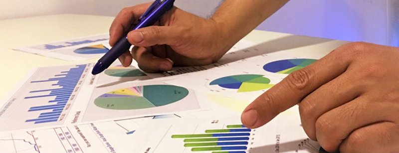
Another great way to humanize data is through visuals. Infographics, charts, and diagrams can help break down complex statistics into digestible, easy-to-understand pieces. But don’t stop at the usual bar graphs or pie charts. Get creative! Could you represent your data as a tree, where each leaf is a person helped? Or perhaps a map that shows the real-world locations where you’ve made a difference? Visuals can be a powerful tool to help your audience ‘see’ the impact.
Showcase the Individual, not just the Group
When we talk about data, we often talk in aggregates. And that makes sense — we need to show the scale of the problems we’re tackling and the impact we’re making. But remember, each data point represents an individual — a person with hopes, dreams, and struggles.
Take some time to spotlight some of these individuals. Share their stories, their victories, and even their setbacks. Not only does this help to humanize your data, but it also helps remind your audience (and yourself) why you’re doing what you’re doing.
Highlight the Difference Made
Lastly, don’t forget to show the ‘before’ and ‘after’. Data isn’t just about where we are, it’s about where we’ve come from and where we’re going. If you’ve reduced local pollution levels by 15% in the last year, tell the story of what that 15% difference looks like. Are there more birds in the local park? Are asthma rates down? Has the smog lifted enough that residents can see the stars for the first time in years? Painting this picture makes your data tangible and relatable.
Humanizing your data is about more than just making your annual reports or grant applications more engaging (though it definitely helps with that!). It’s about honoring the individuals behind the statistics, reminding us all why we’re in this sector: to make a difference in people’s lives. So the next time you’re presenting your numbers, take a moment to think about how you can bring those figures to life.
Because, in the end, your data isn’t just numbers. It’s the mark of real lives being changed, the measure of hope being given, and the sign of a brighter world being built, one person at a time.
Mission Forward
Mission Forward is a weekly LinkedIn Newsletter written by Paul Durban with tools, tips and tricks to help nonprofits reach their goals. Subscribe to the newsletter on LinkedIn.

